


Fall 2018
inclusive
wayfinding
videography
Britney Balmer
Kennedy Liggett
Anna Schecterson
Gabriella Wikidal
Identify a design opportunity within Raleigh Union Station and respond with a two-week ideational study exploring the interrelationship of branding, service, and interaction design.
When we travel through a space, we rely on navigational signs to tell us where to go. But for visually impaired individuals who can’t see these signs, navigating a space can be extremely frustrating and intimidating.
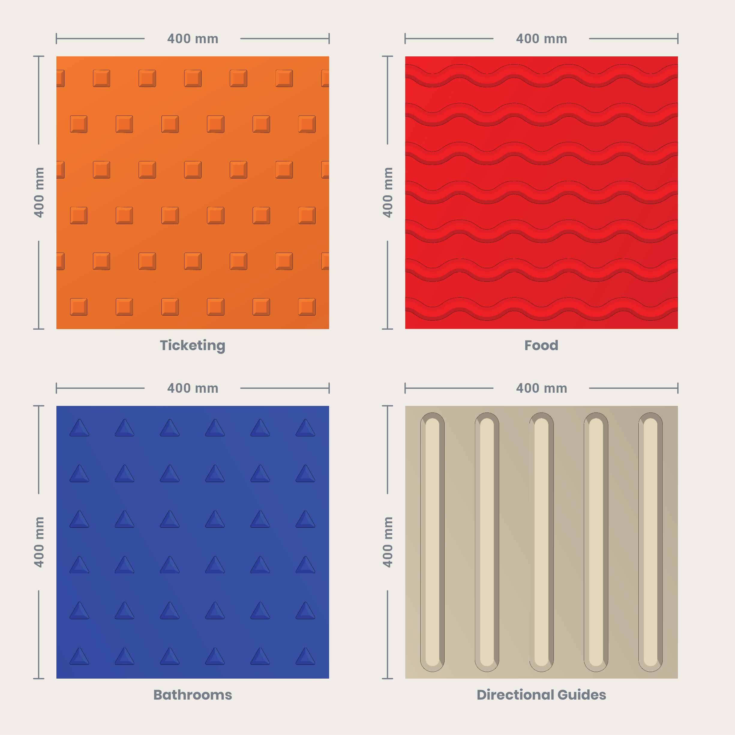
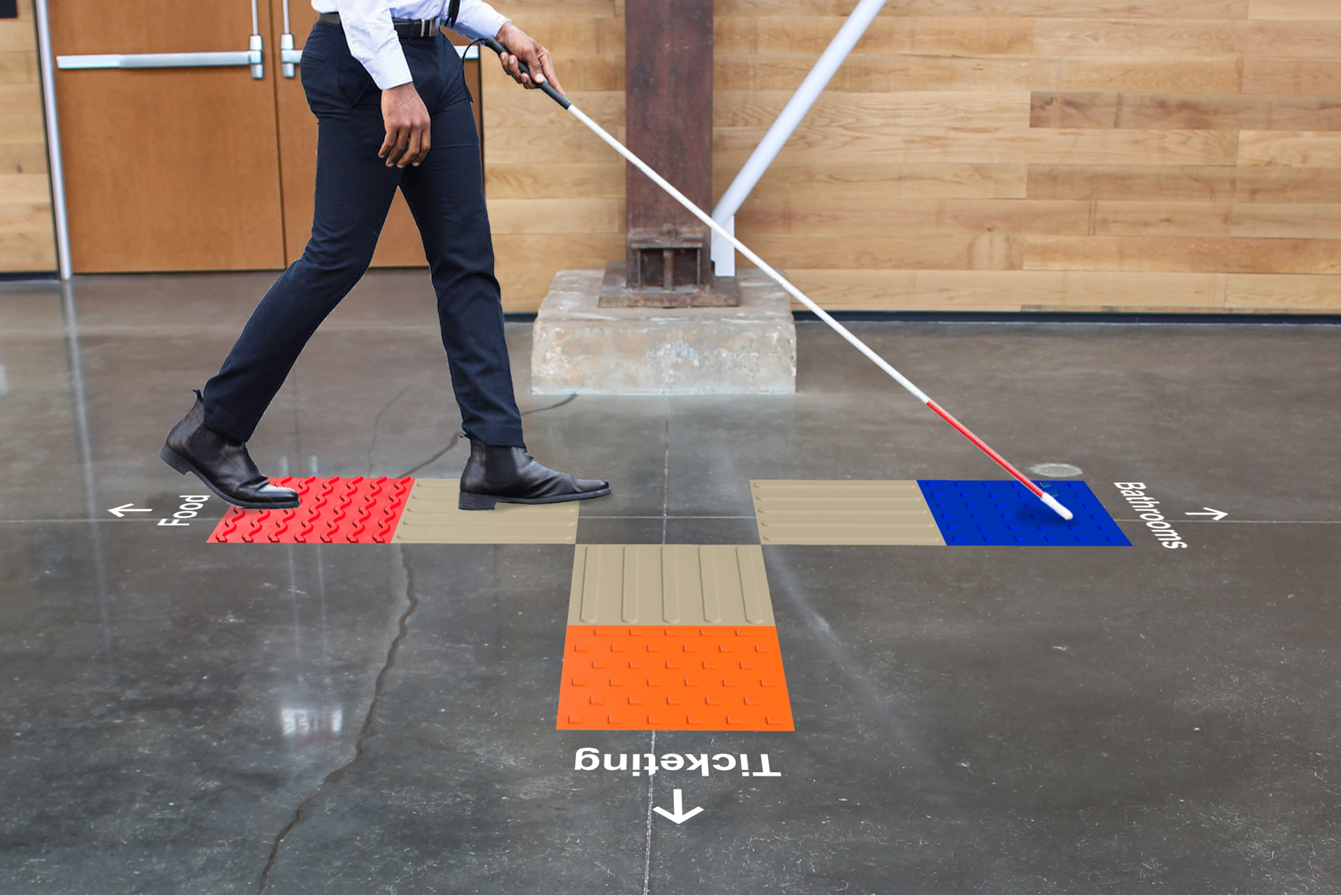
We designed a wayfinding system that empowers visually impaired individuals to independently navigate the train station while also enhancing the wayfinding experience for those who are sighted. Navigational guidance squares would be located throughout the train station, using color and texture to guide visitors to essential spaces.

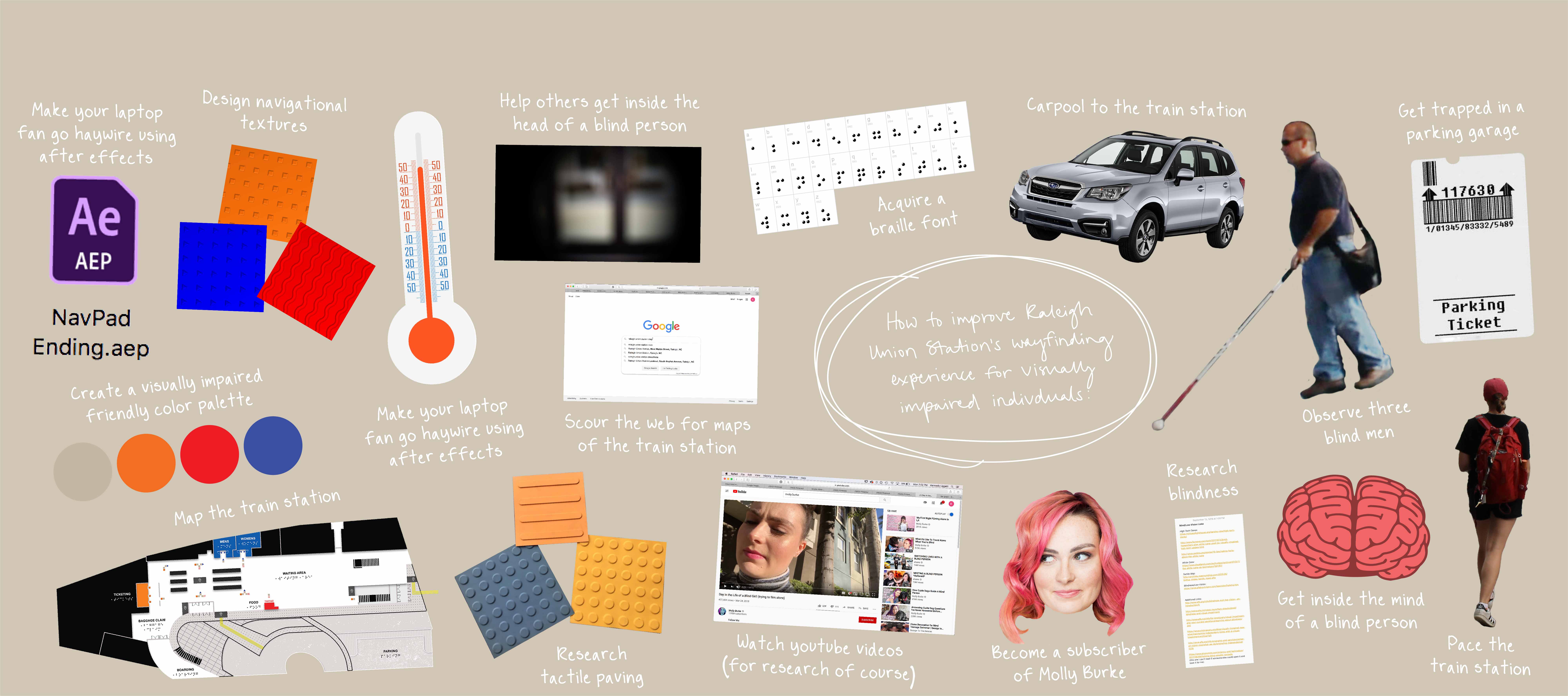
We began by researching Raleigh Union Station to see if we could identify any opportunities. However, throughout our research, we had trouble identifying any worthy needs.
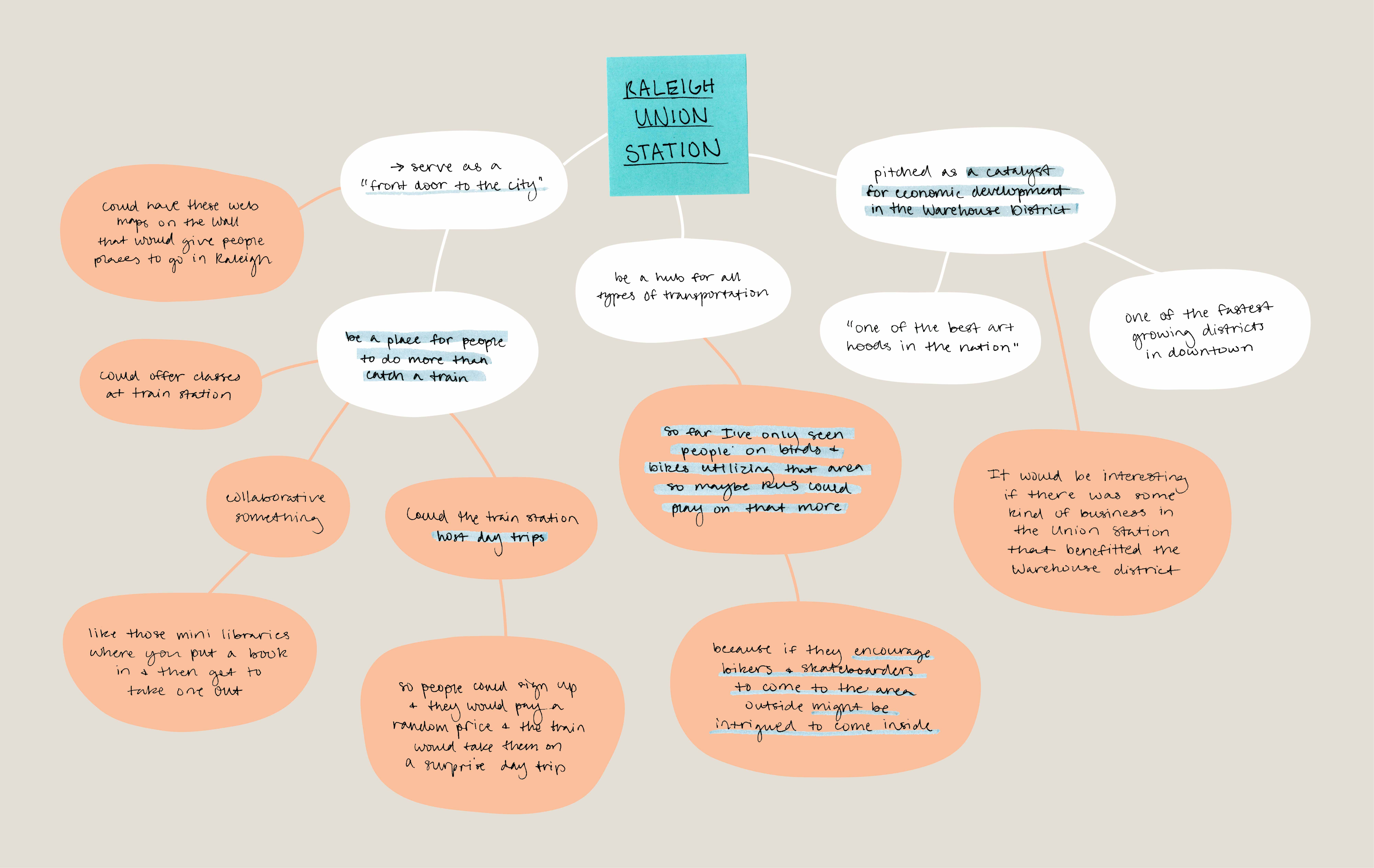
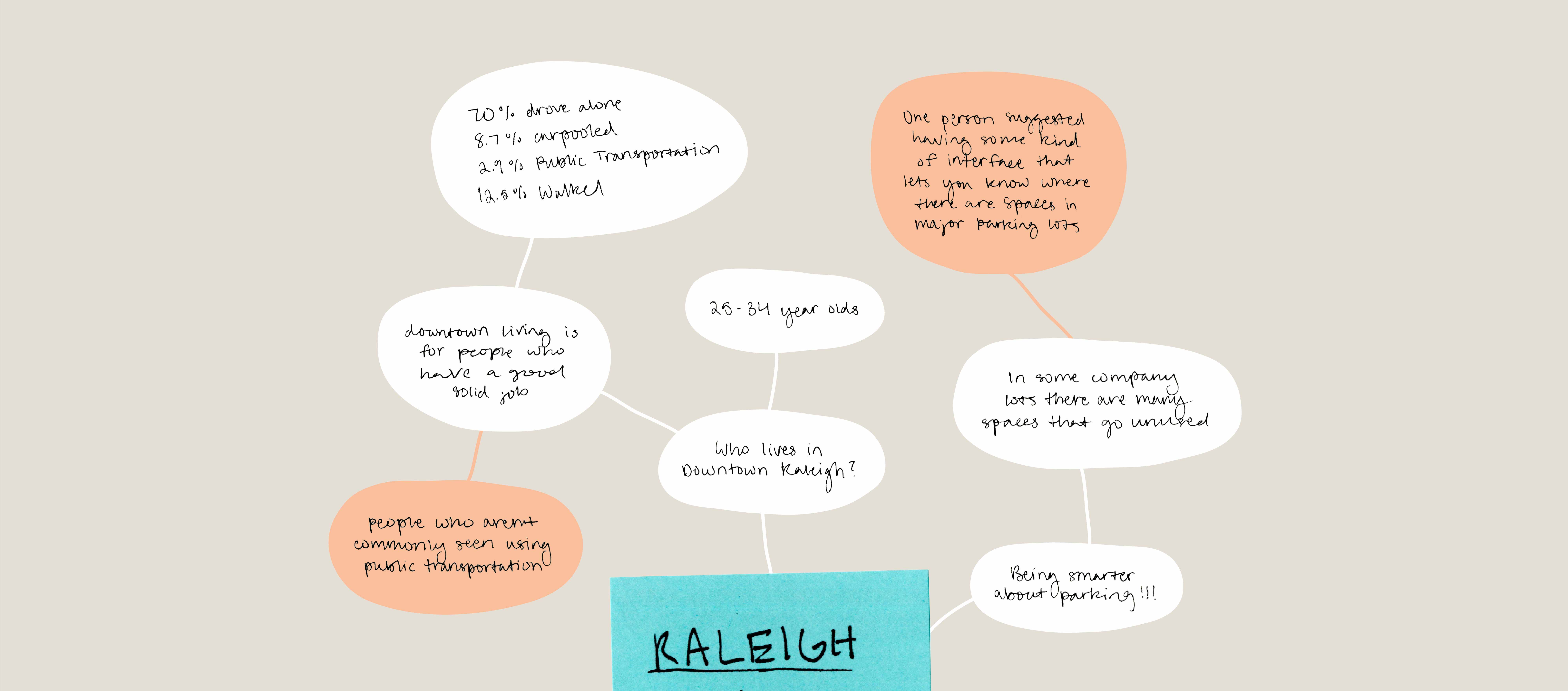
We then decided to look beyond the train station, hoping an opportunity would present itself. We began researching Raleigh in general and discovered issues revolving around transportation and parking, but once again, felt like we were at a dead end.
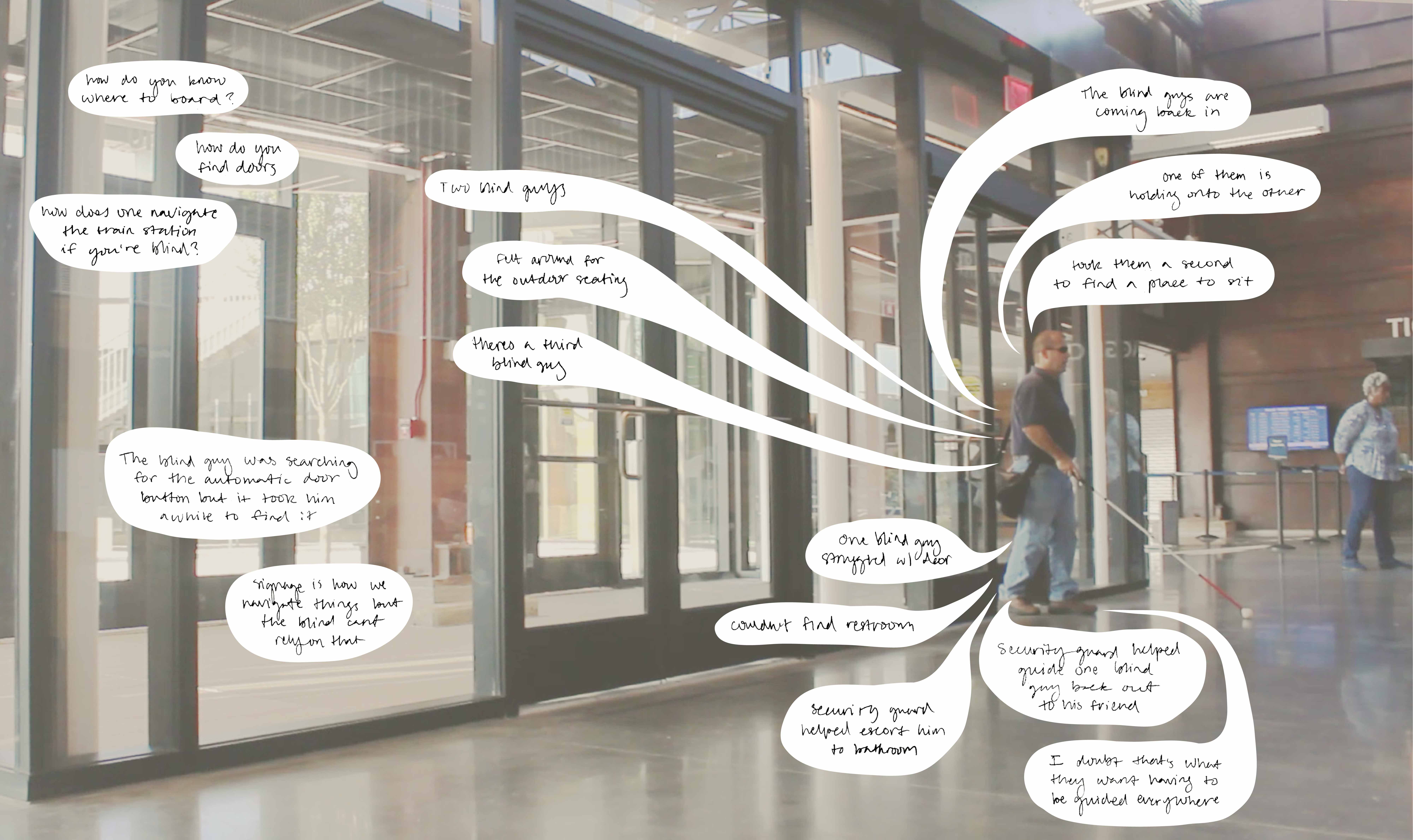
We then visited Raleigh Union Station to observe how people interacted within the space. During our observations, we noticed three visually impaired men who were struggling to navigate the train station. As we observed them, we began questioning how one navigated a space when they couldn’t physically see it, and that’s when we realized we had finally identified a worthy need.
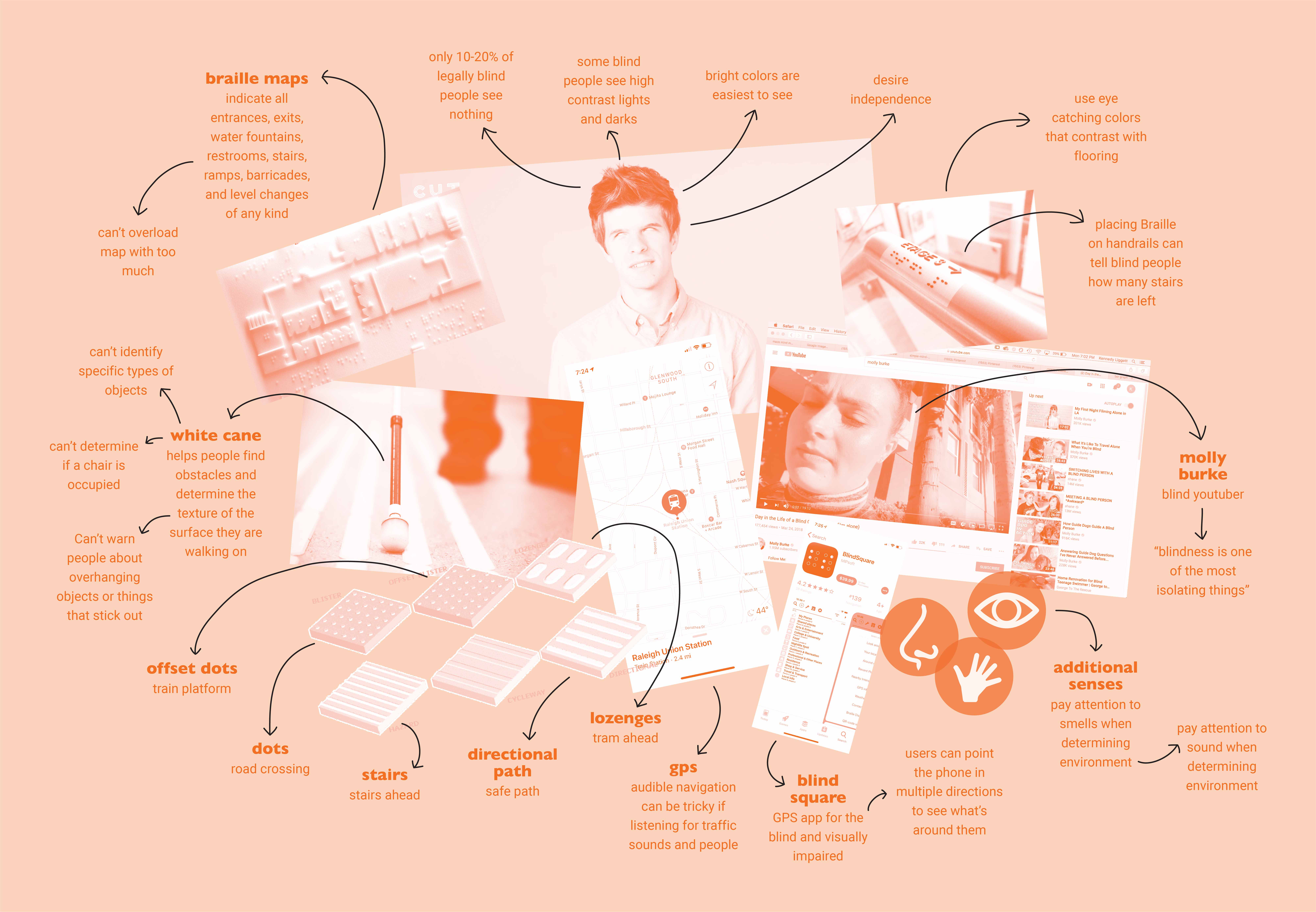
We then took it upon ourselves to learn everything we could about blindness and low vision. While researching, we noticed several apps already existed to help visually impaired individuals navigate a space. However, we were interested in designing something into the environment so visually impaired visitors would have one less thing to deal with.
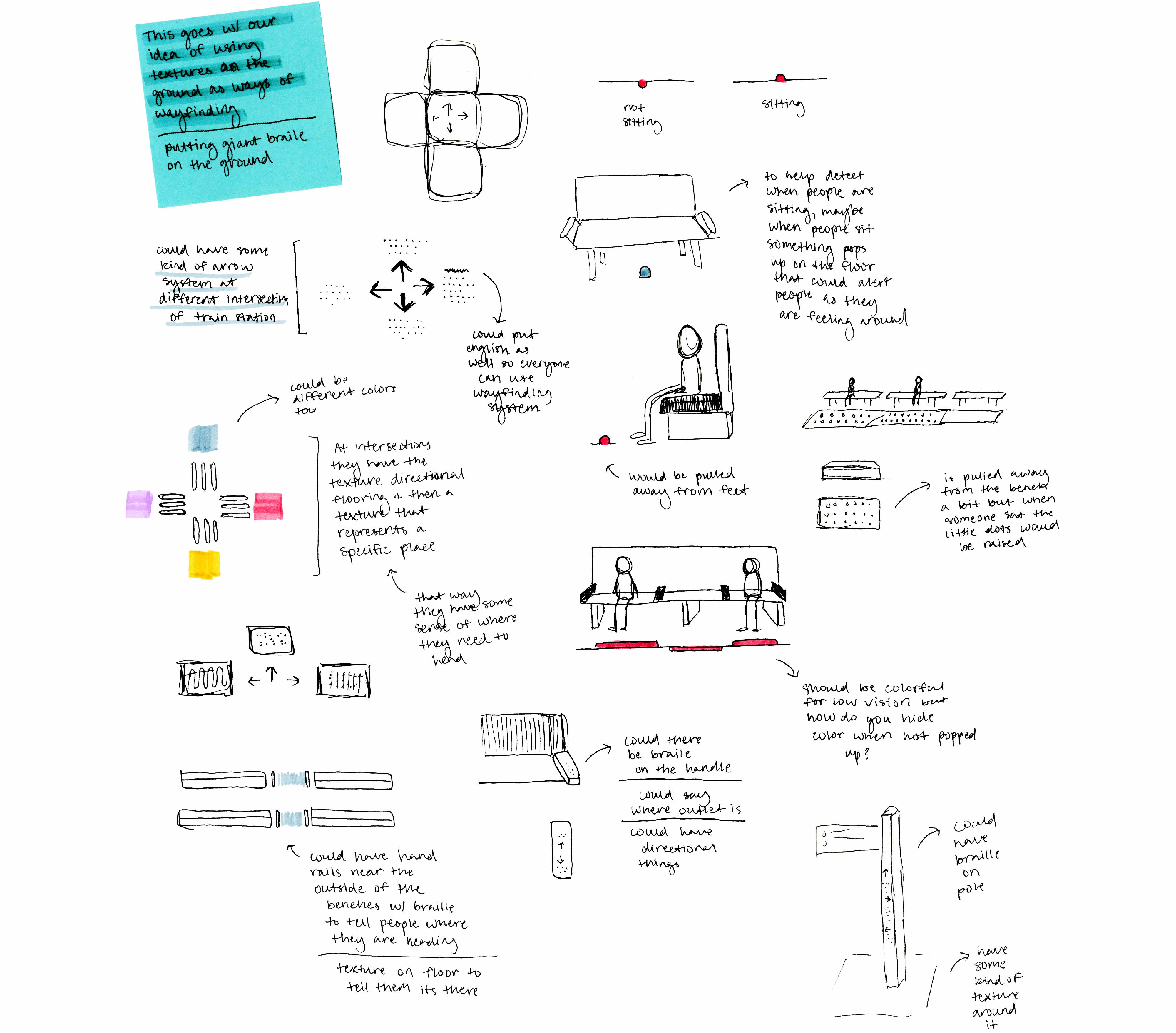
Sketches iterating different approaches we took to wayfinding.
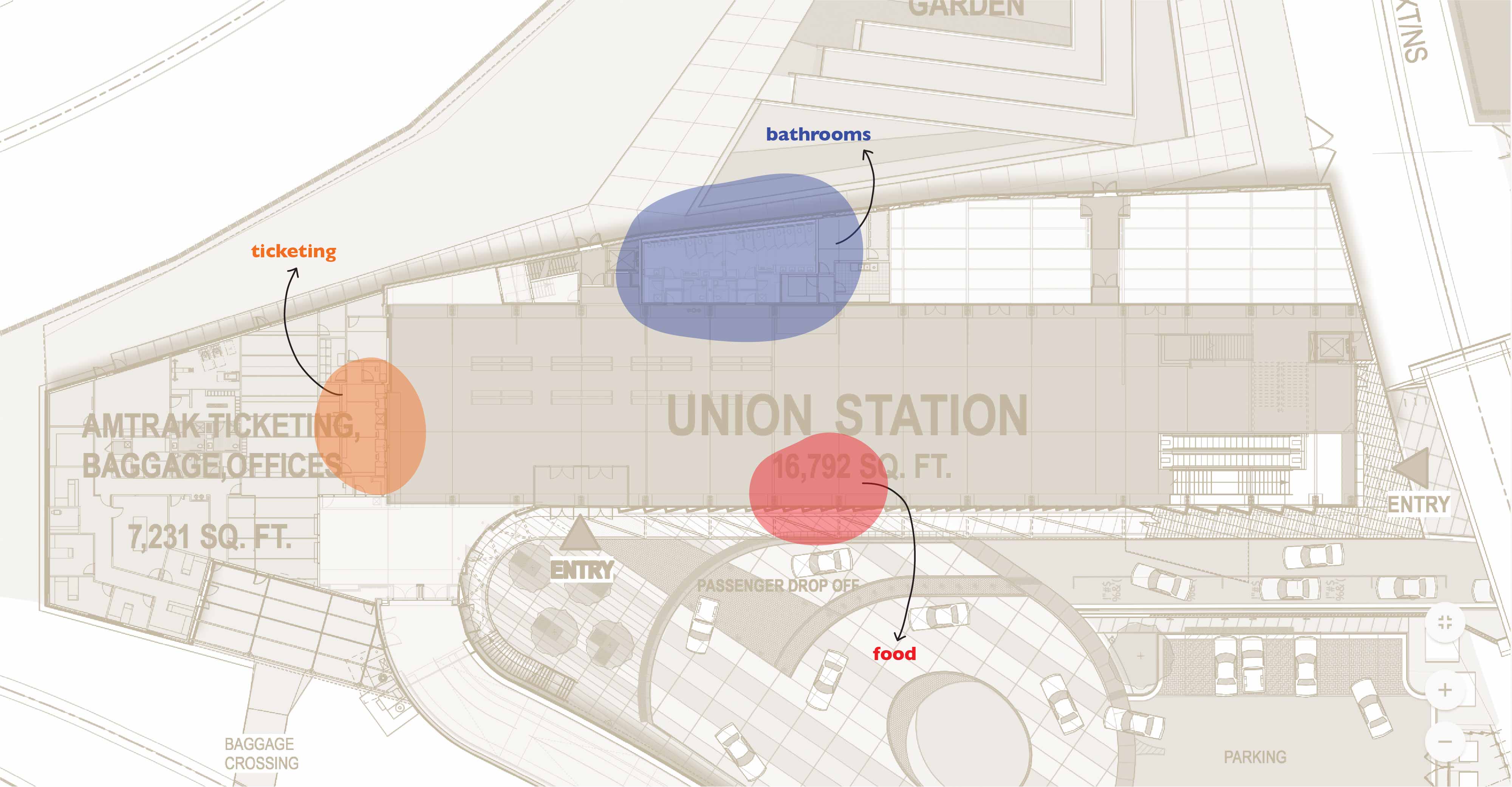
We then determined the main areas within the train station that visitors would want to get to: food, bathrooms, and ticketing.

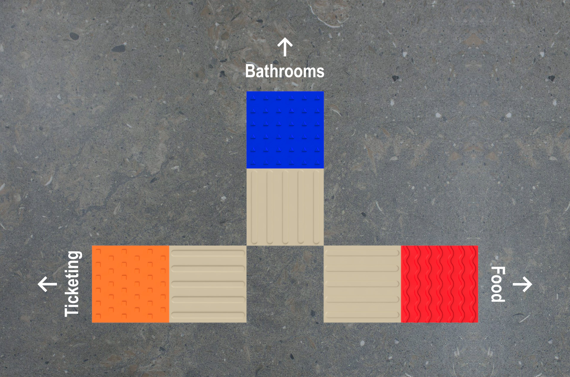
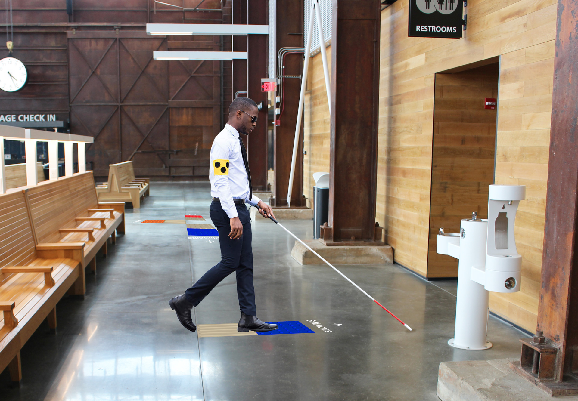
Textural guidance squares would be located at major intersections within the train station. Each area within the station is identified by its own unique texture and color. Leading up to each guidance square is a vertically striped directional path. These paths are commonly used to signify safe routes for blind and low-vision individuals. The direction of the stripes indicates which way a visitor should go to reach the location of the area the guidance square represents.

Textured maps would be located in the train station, as well as outside the main entrances. Vertically striped directional paths would lead blind and low vision individuals to the outdoor maps so they could familiarize themselves with the wayfinding system. The maps would be located on neoprene rubber flooring so visitors could recognize the change in floor texture and know they've reached a map.
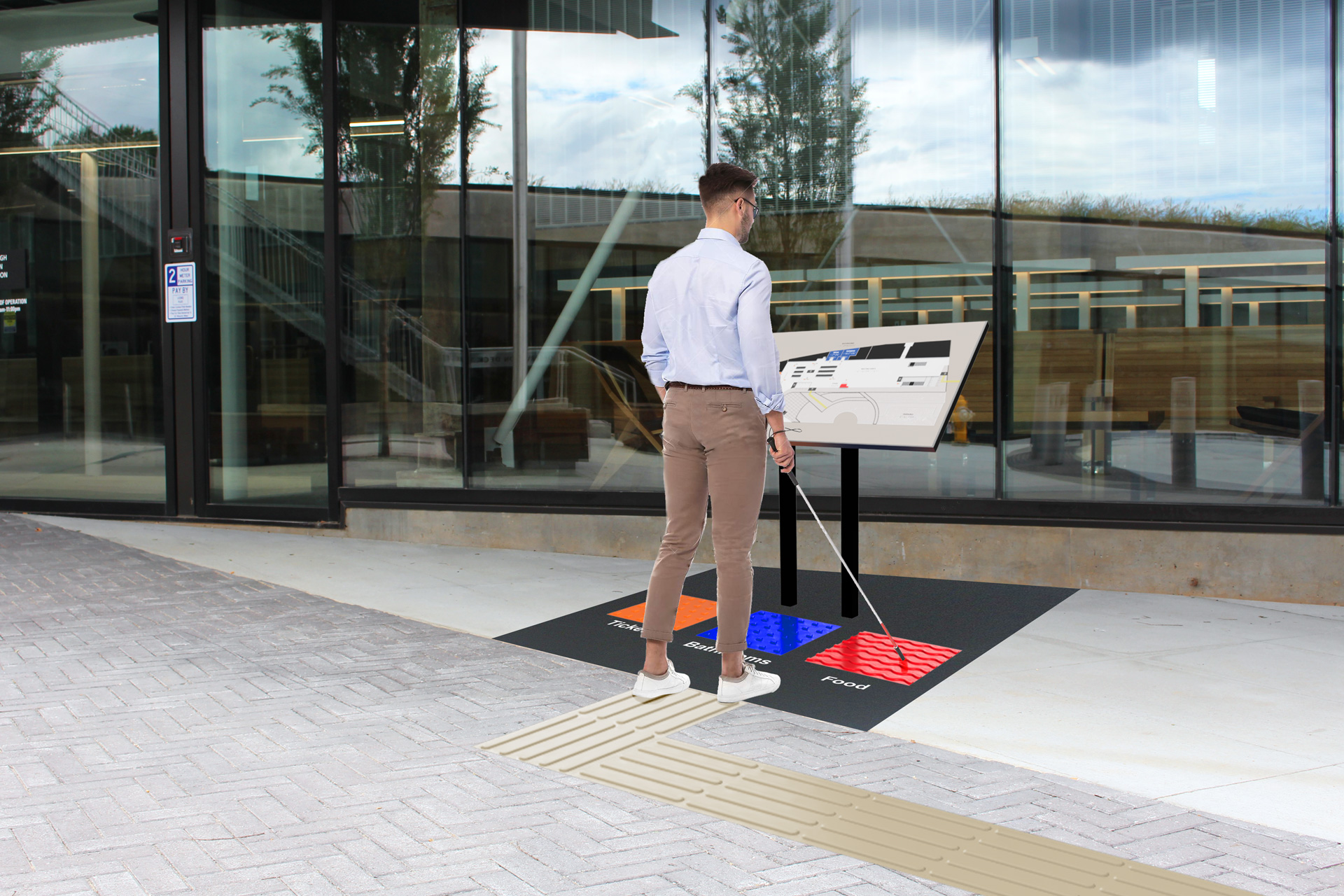
Three textural guidance squares are placed under each map. When a visitor places their foot on one of the squares, an audio clip will play telling them which area that texture represents.
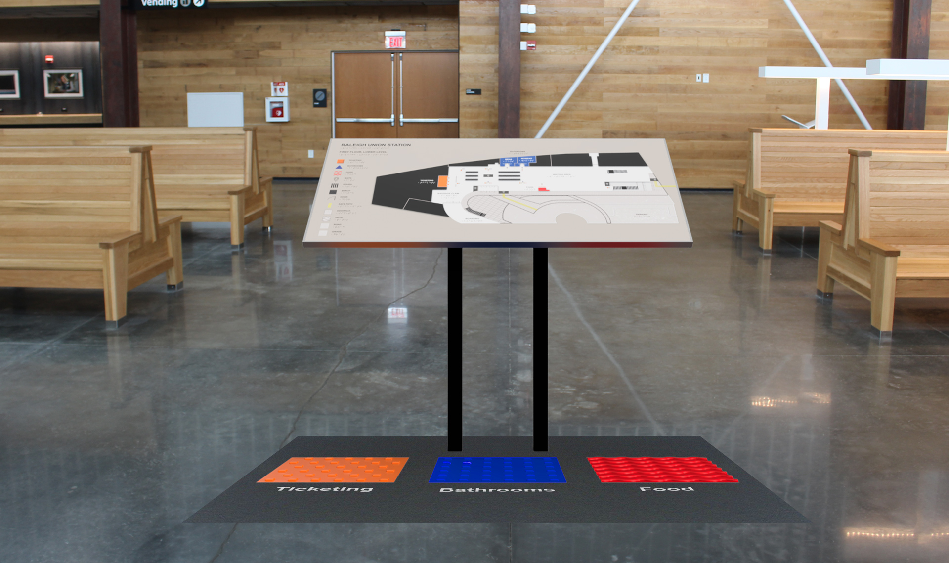
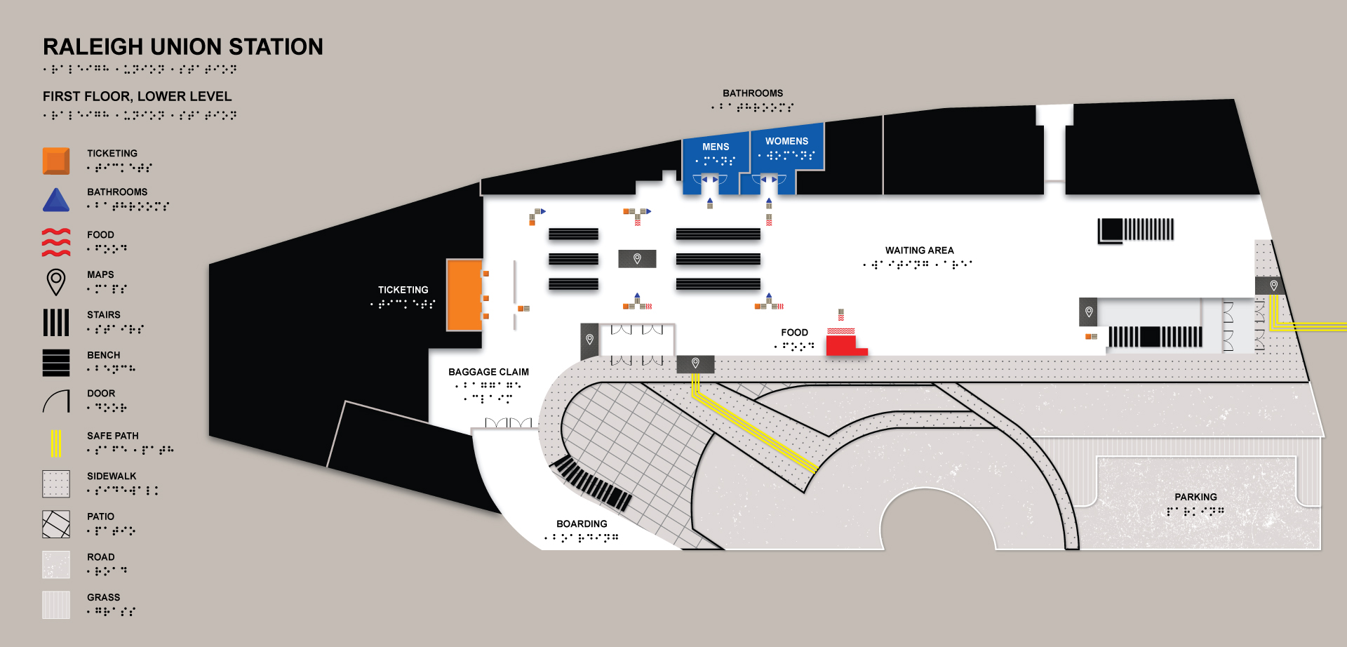
The maps contain standard typography, as well as braille, so both sighted and non-sighted people can use them. They’re additionally placed at an angle so visually impaired individuals can easily run their hands across them. The rooms and walls are raised as well as different symbols and patterns which represent the locations of the maps, guidance squares, and additional features.
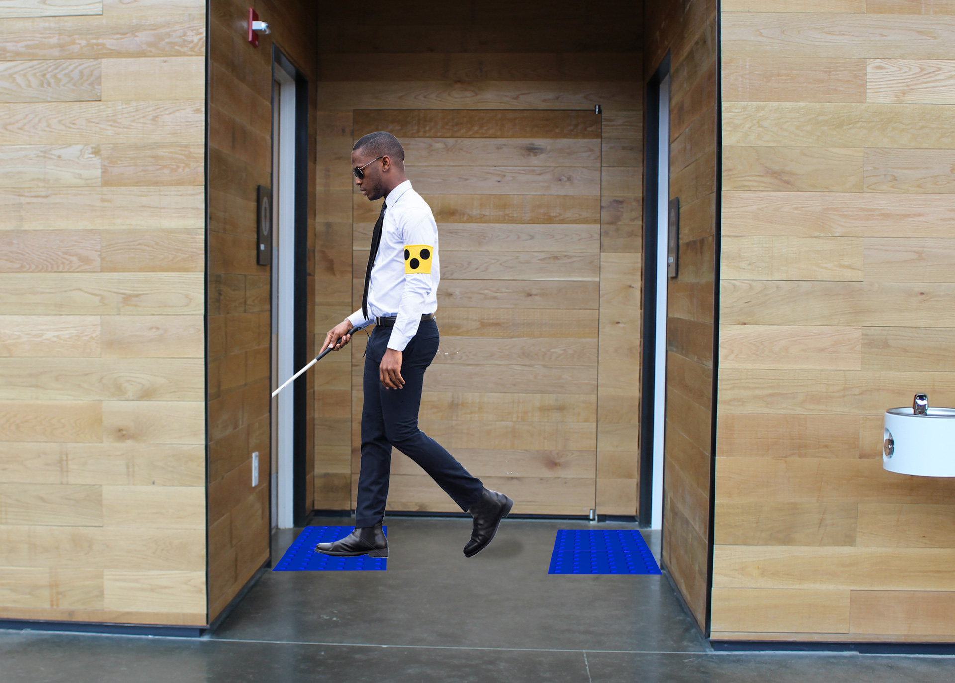
Series of images showing the path a visually impaired individual would take to get to the bathrooms.
Video documenting the frustrating experiences a visually impaired individual can have at the train station, as well as how our wayfinding system can be used to improve those experiences.
